Introduction
For this project, I did a full rebrand for Sabor Latino, a local Mexican restaurant looking to refresh its identity and create a stronger emotional connection with customers. The existing visuals felt inconsistent, and the brand lacked a clear personality that reflected the warmth and tradition of its food.
The goal was to develop a system that felt welcoming, handmade, and rooted in family culture. I wanted the identity to capture the comfort of home-cooked meals and the energy of a lively, community-centered restaurant while still feeling modern and versatile across platforms.
Rather than relying on common restaurant tropes, I focused on building a recognizable character and cohesive visual language that could live across packaging, digital spaces, and in-store touchpoints. The intention was to create something memorable, authentic, and distinctly their own.
Research
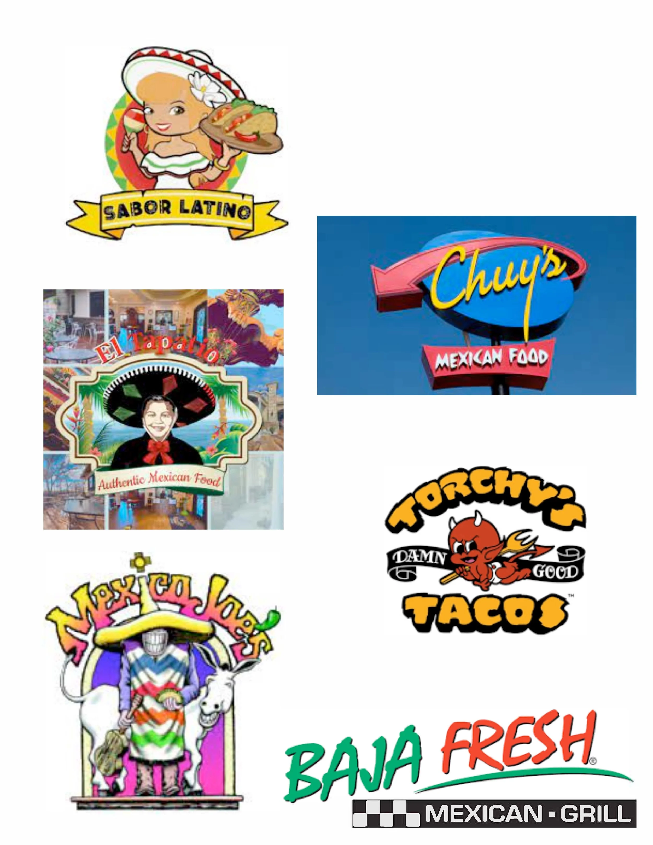
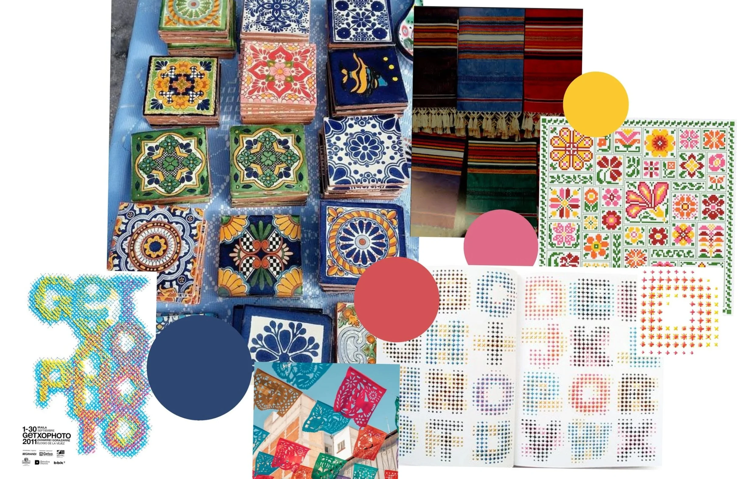
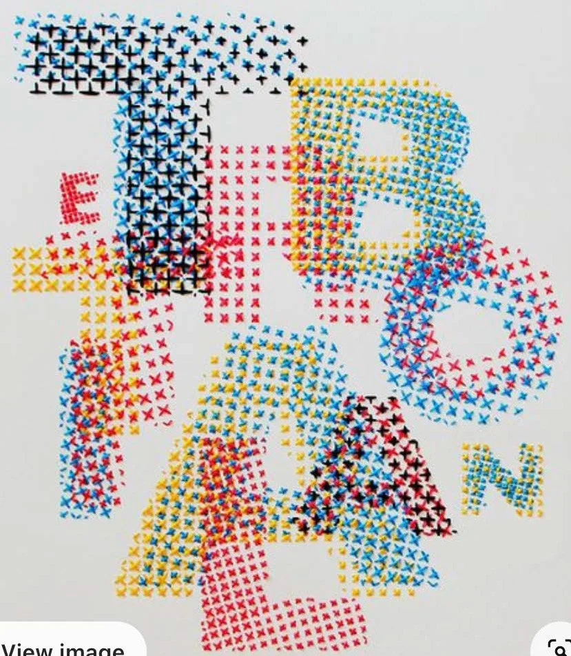
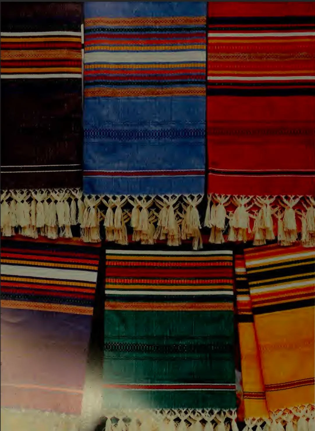
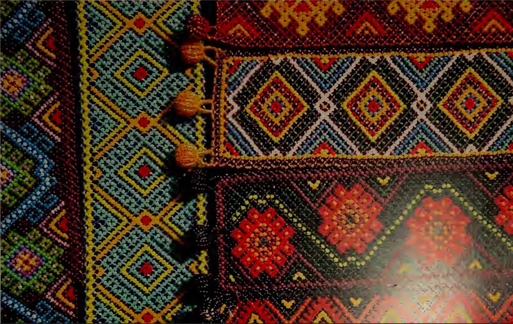
Before designing, I explored Mexican culture, traditional colors, patterns, and typography styles to better understand the visual language tied to food, family, and celebration. I also reviewed the restaurant’s existing characters and branding elements to see what could be refined or reimagined.
I created a mood board and gathered references that emphasized handcrafted textures, warm earth tones, and bold, expressive forms. A key consideration throughout this phase was staying authentic and respectful, ensuring the designs felt genuine rather than exaggerated or caricature-like.
Process
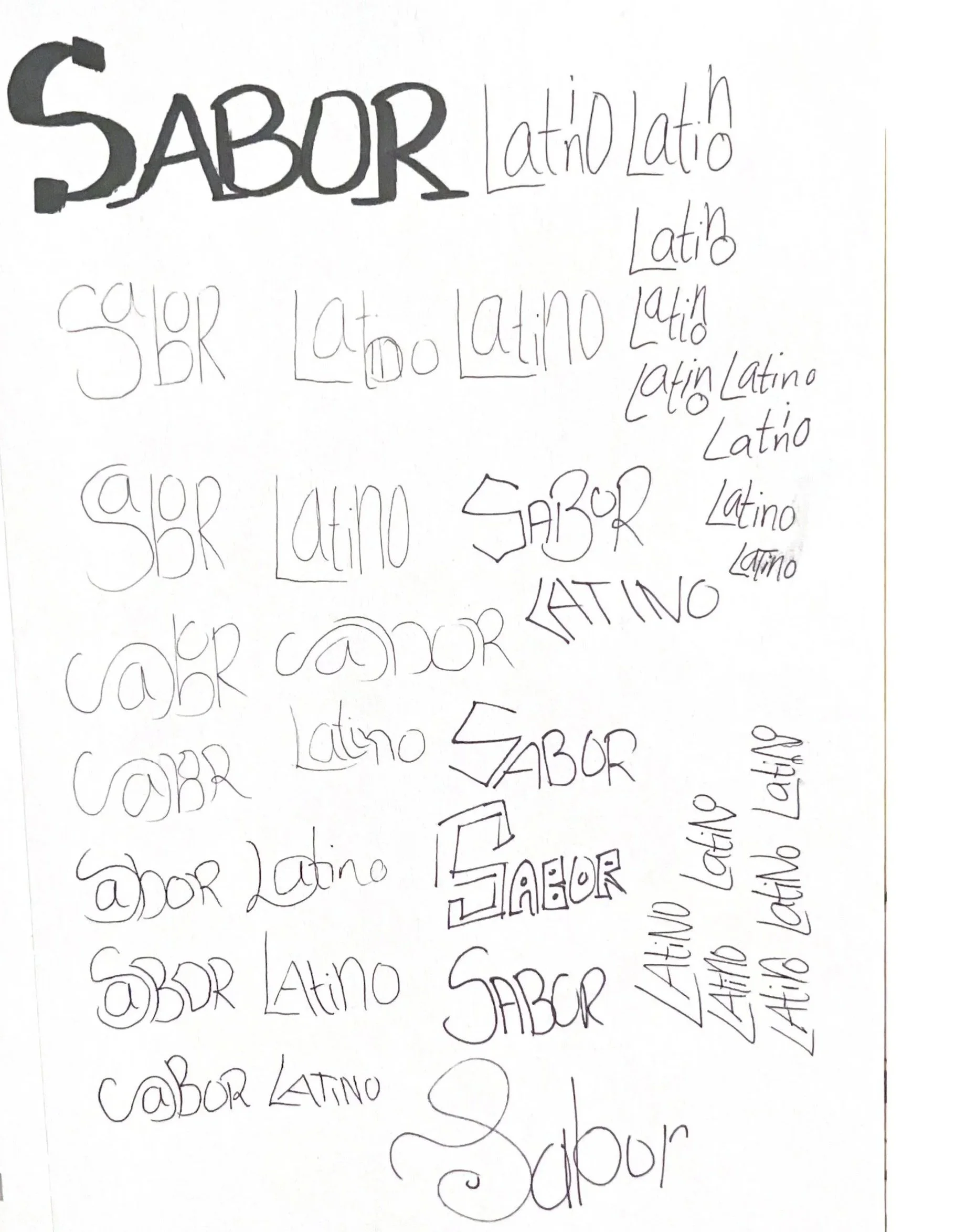
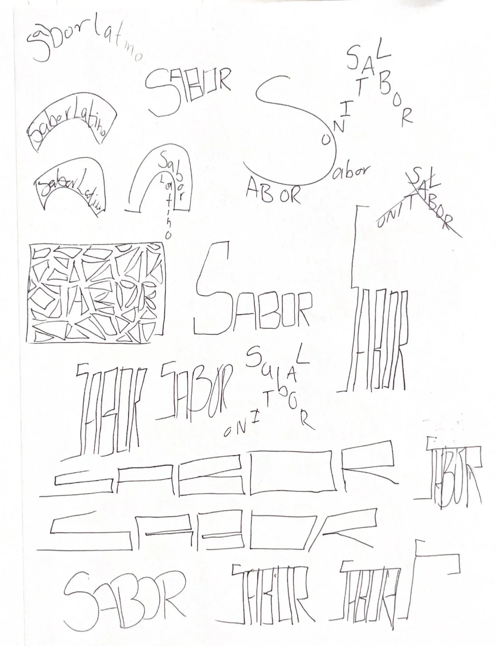
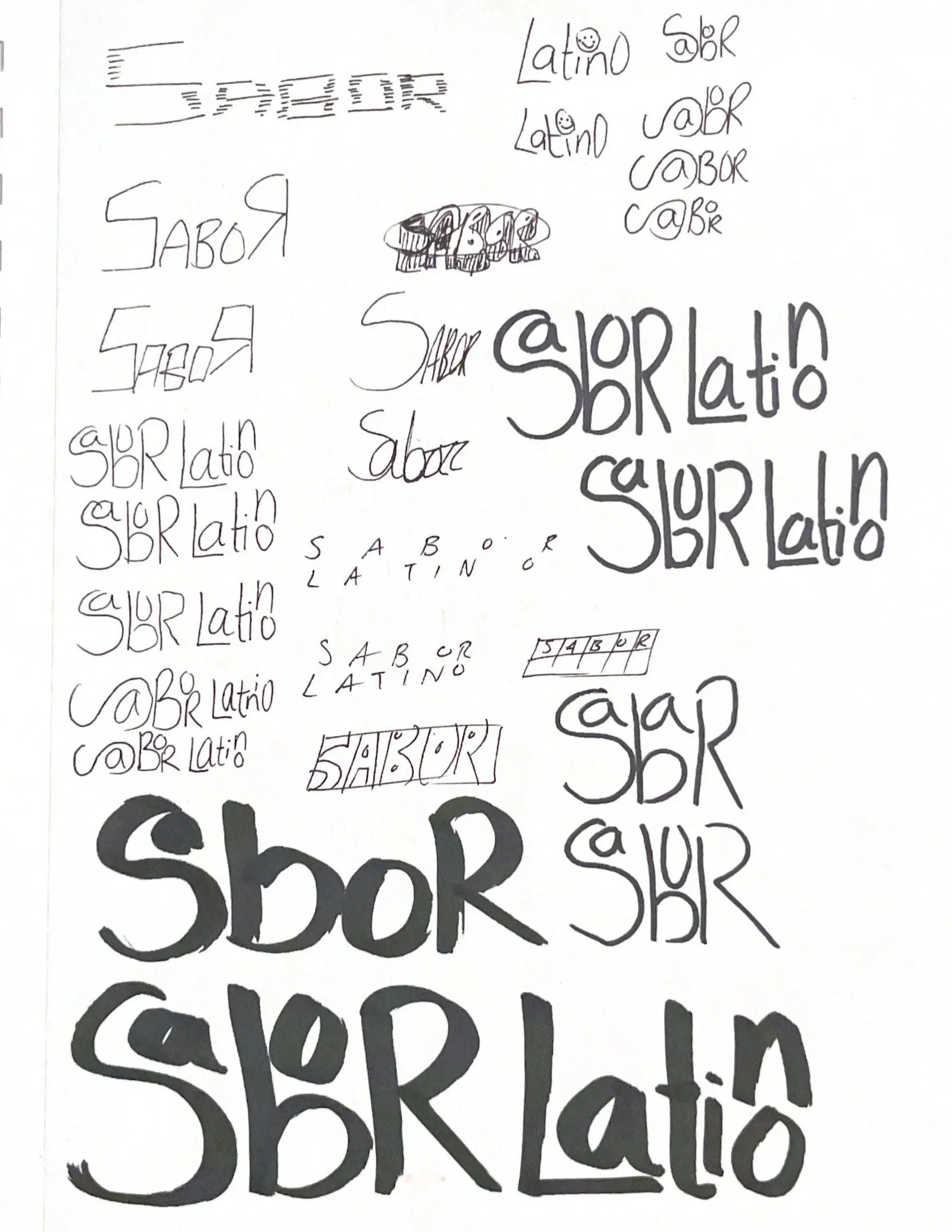
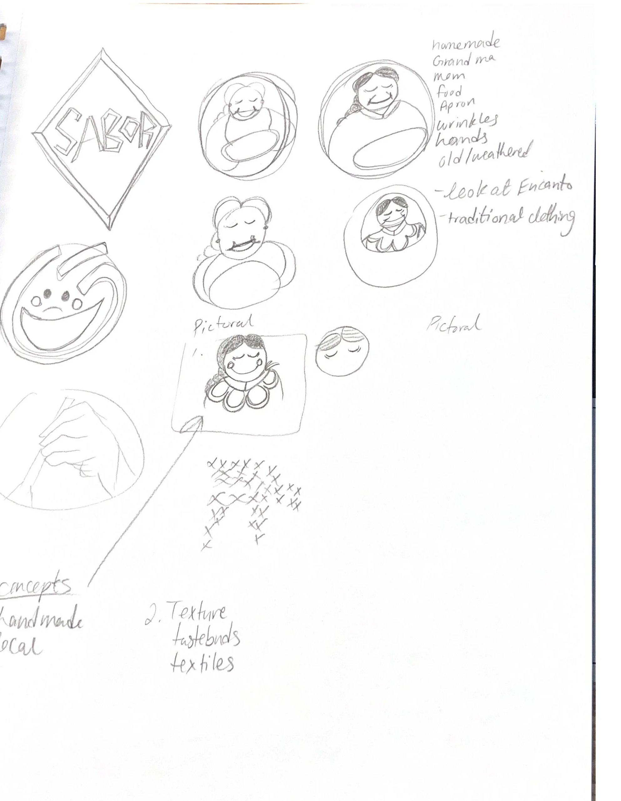
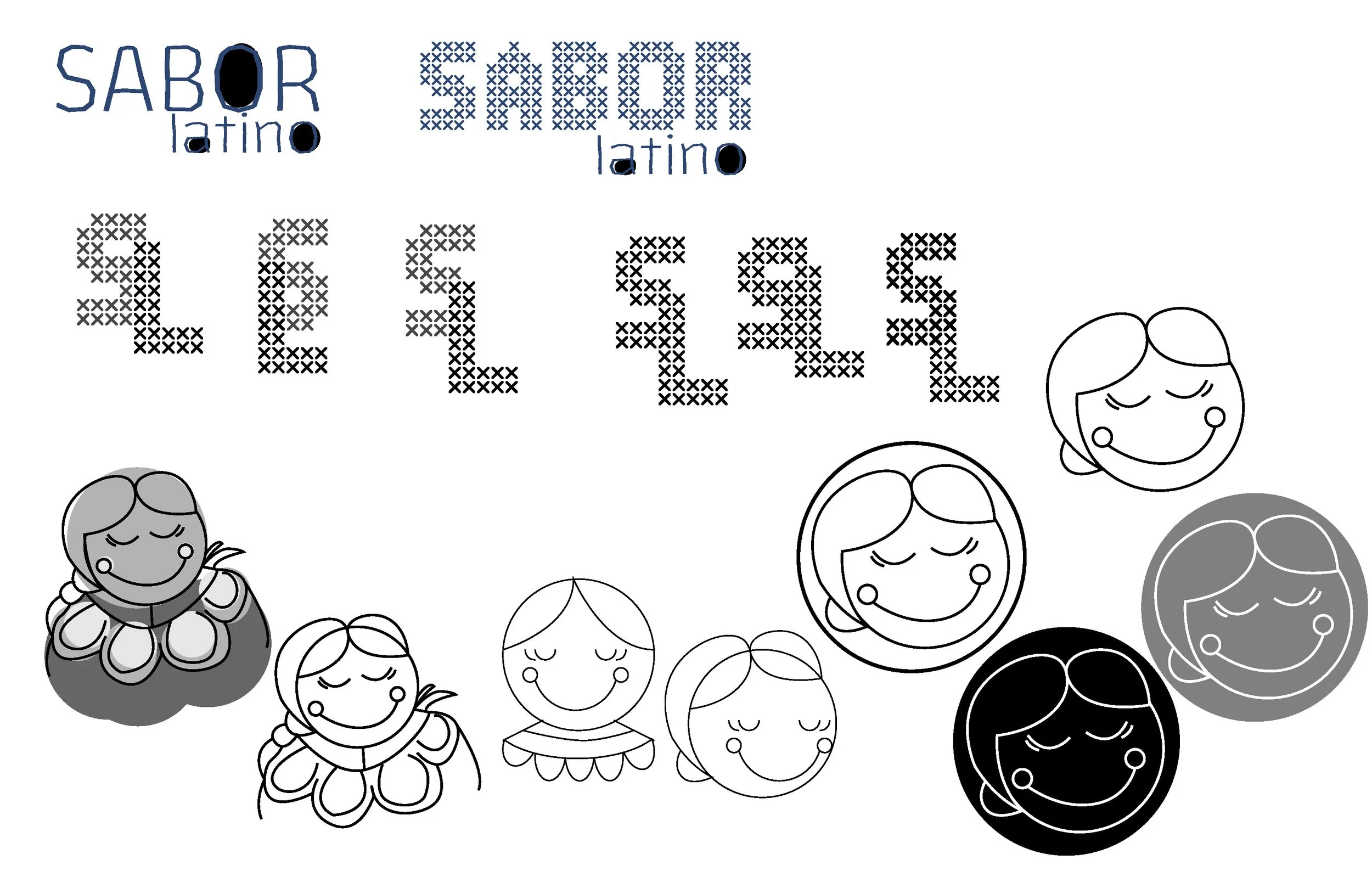
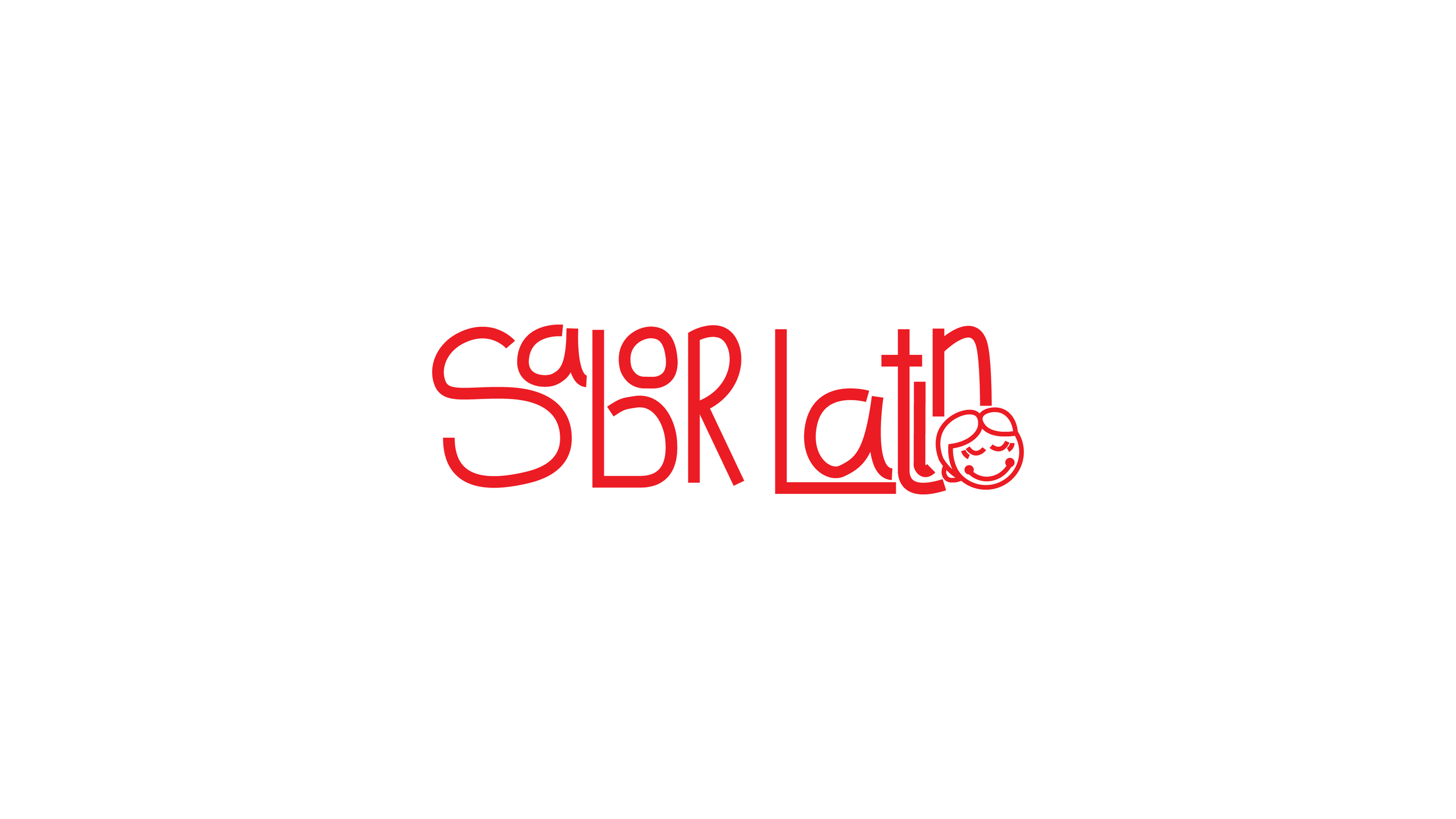
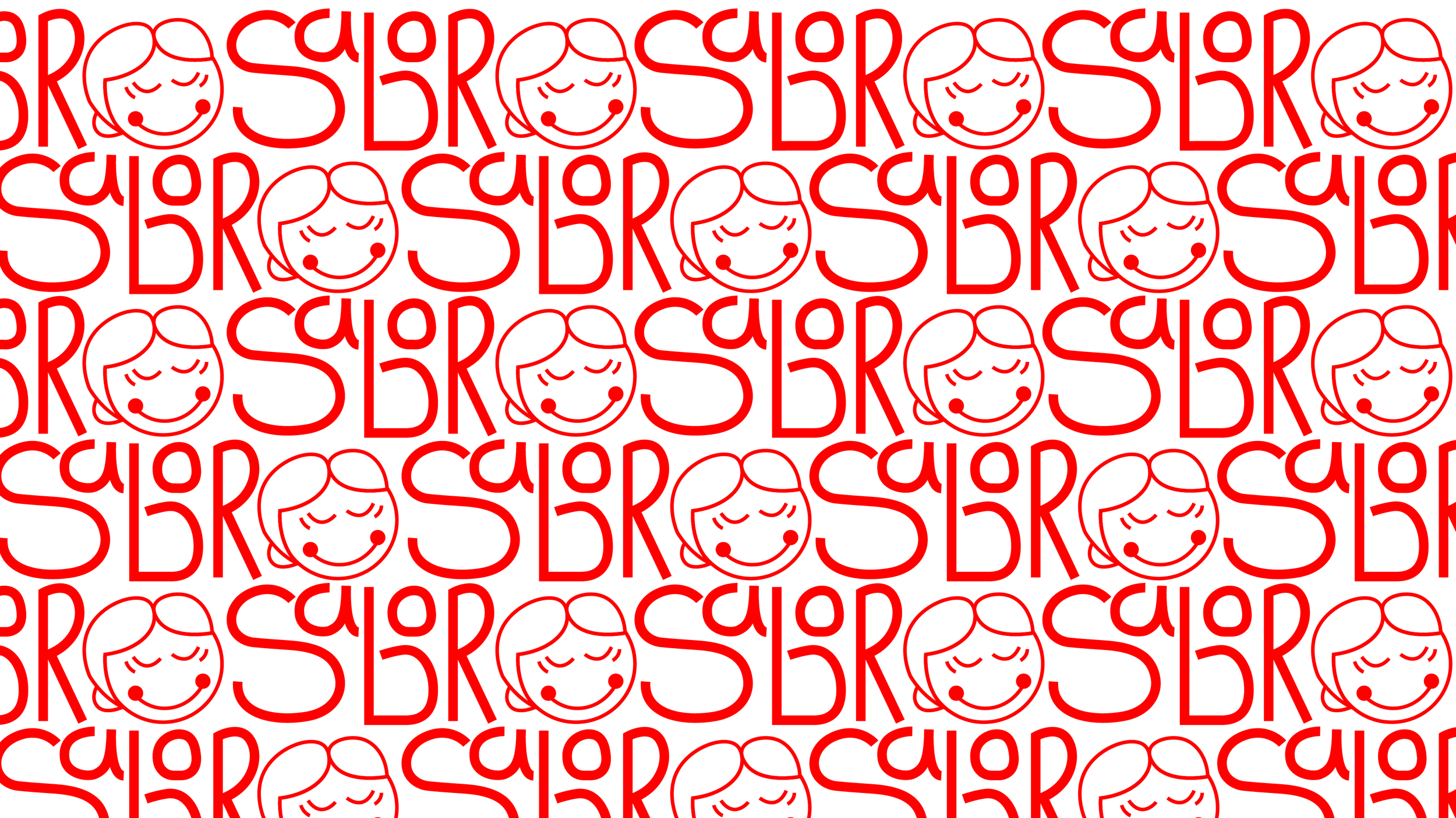
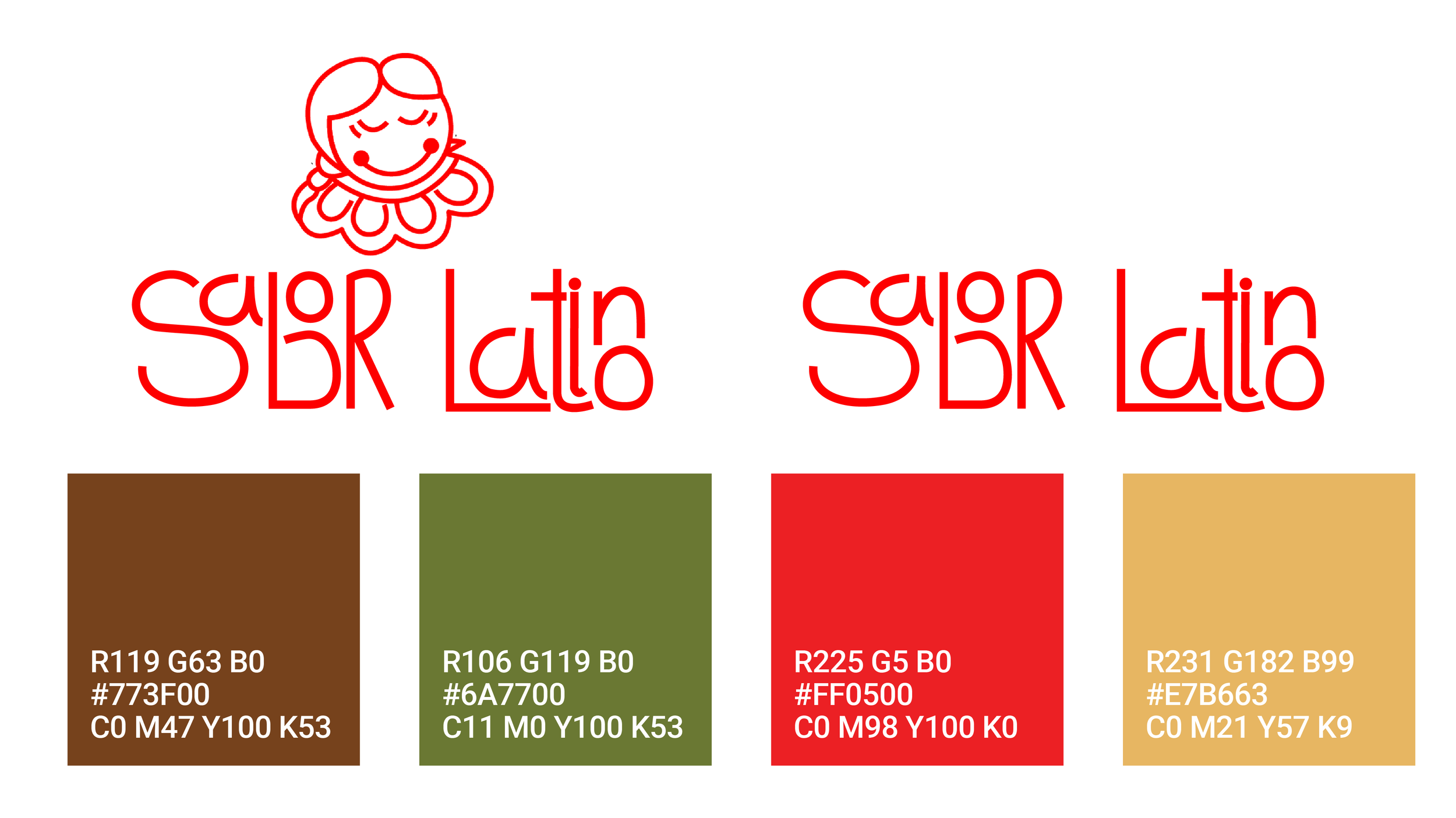
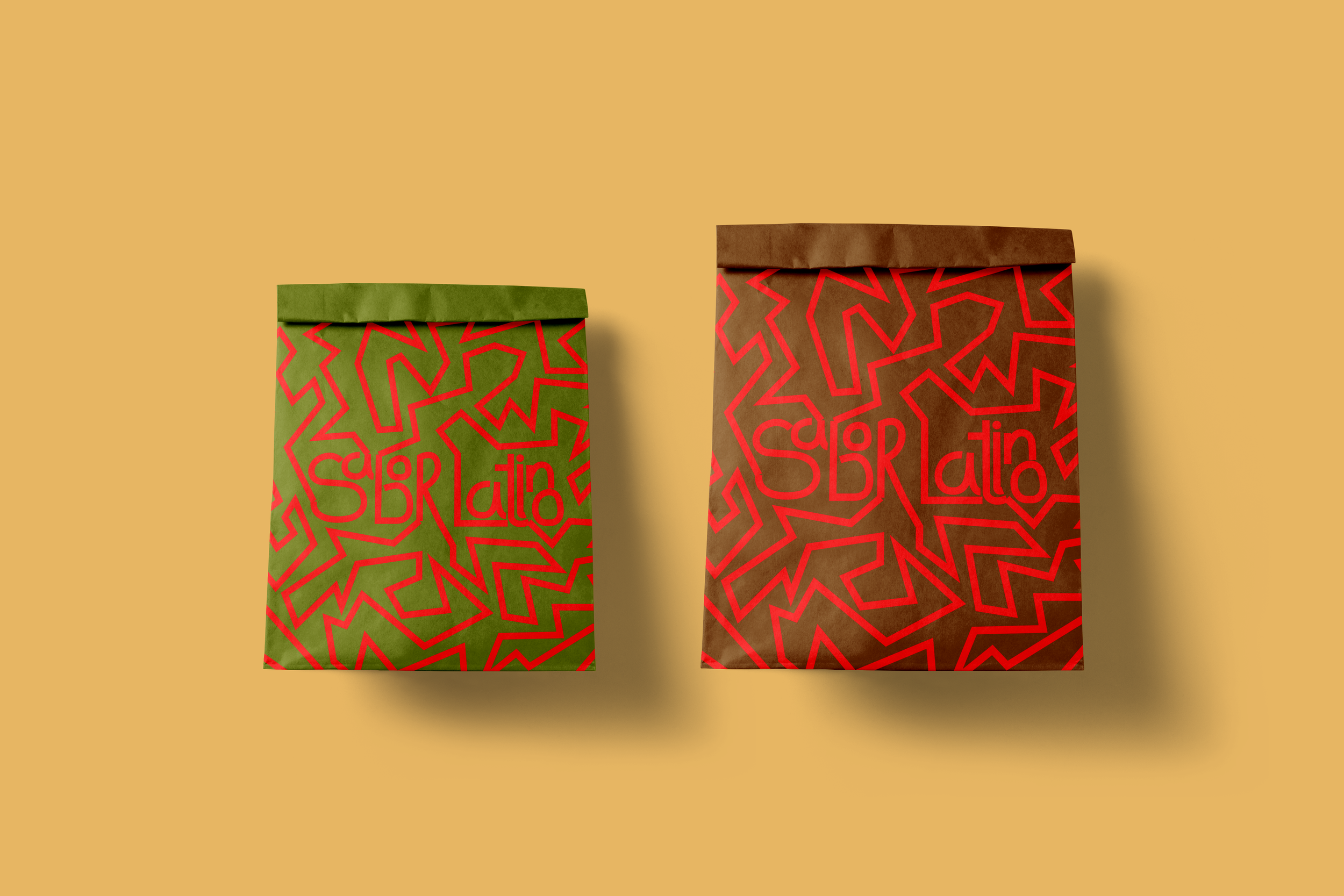
I began by developing a central character, Abuelita, to act as the heart of the brand and represent comfort and tradition. From there, I designed a hand-lettered wordmark with soft, rounded curves and slightly disconnected joints to give the logo an imperfect, handmade quality. The color palette focused on warm, bright earth tones to reinforce the inviting atmosphere.
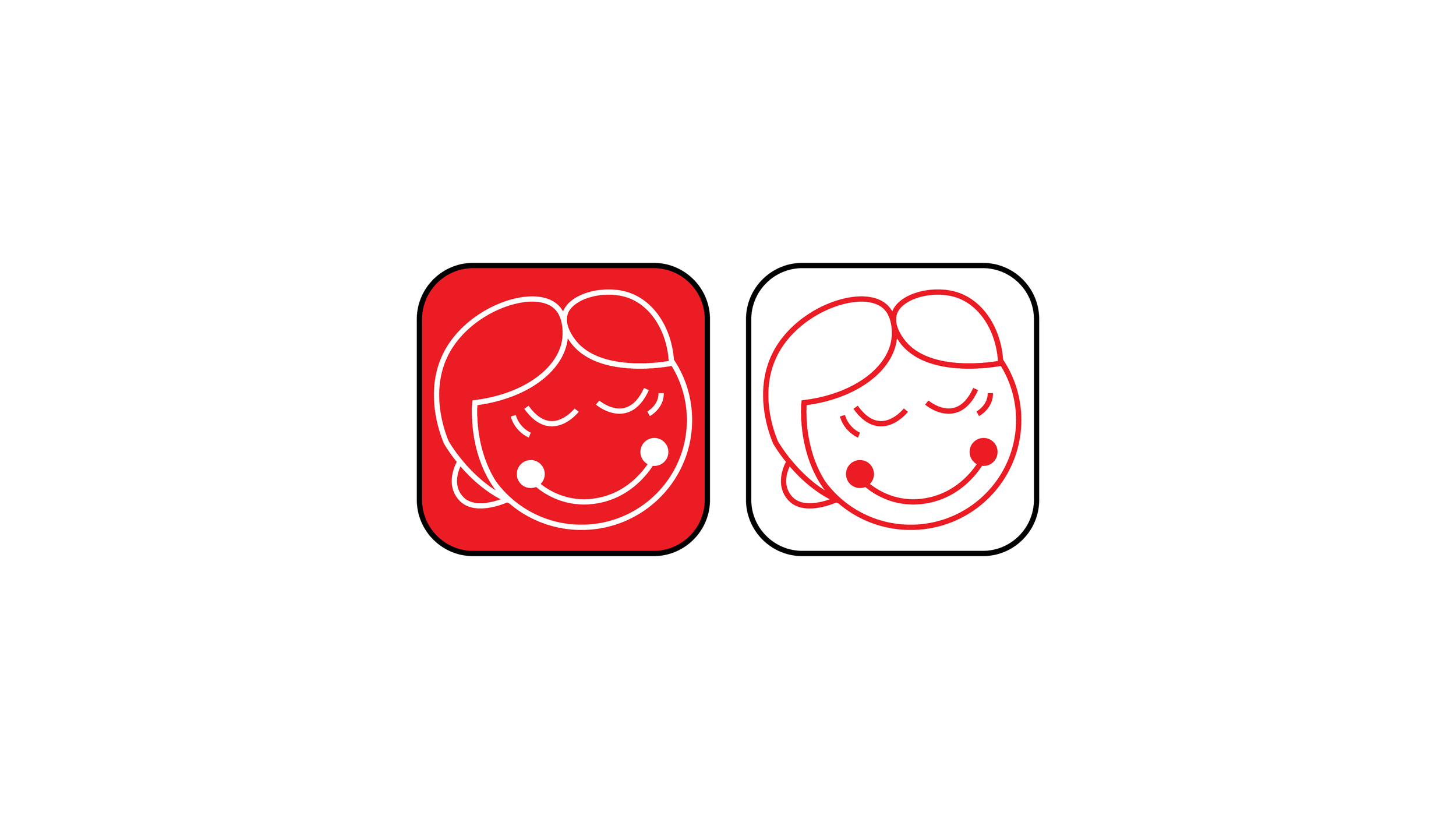
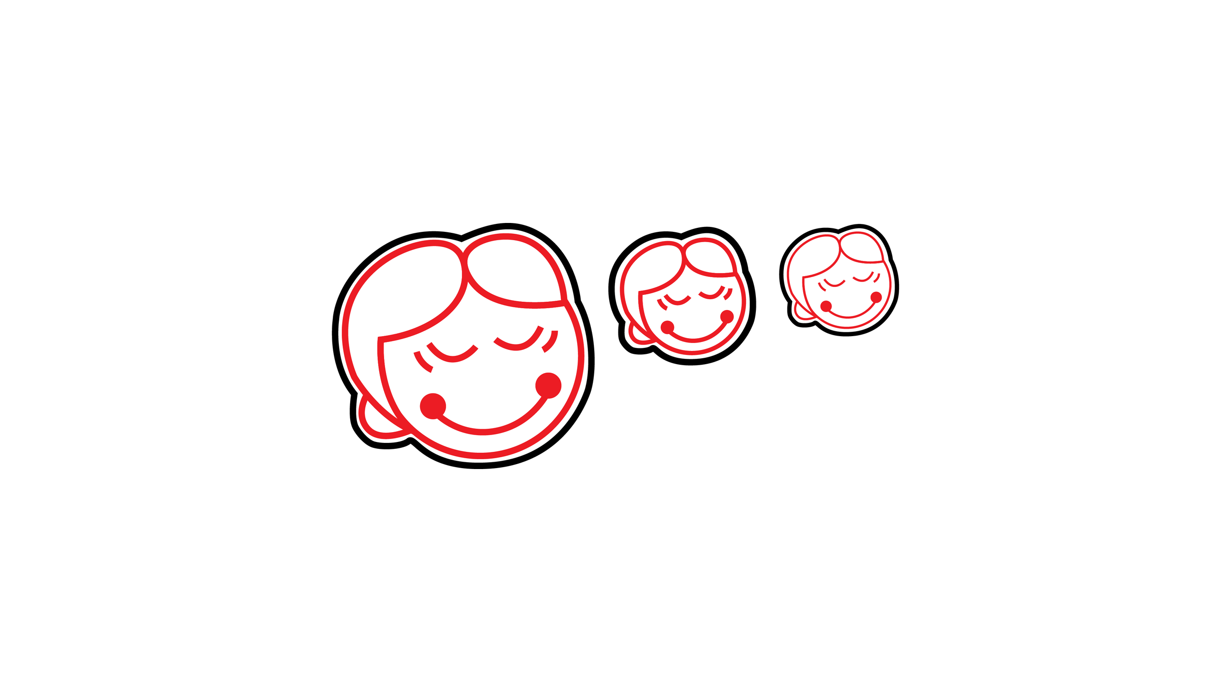
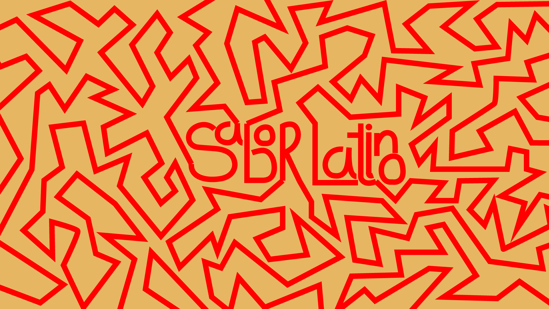
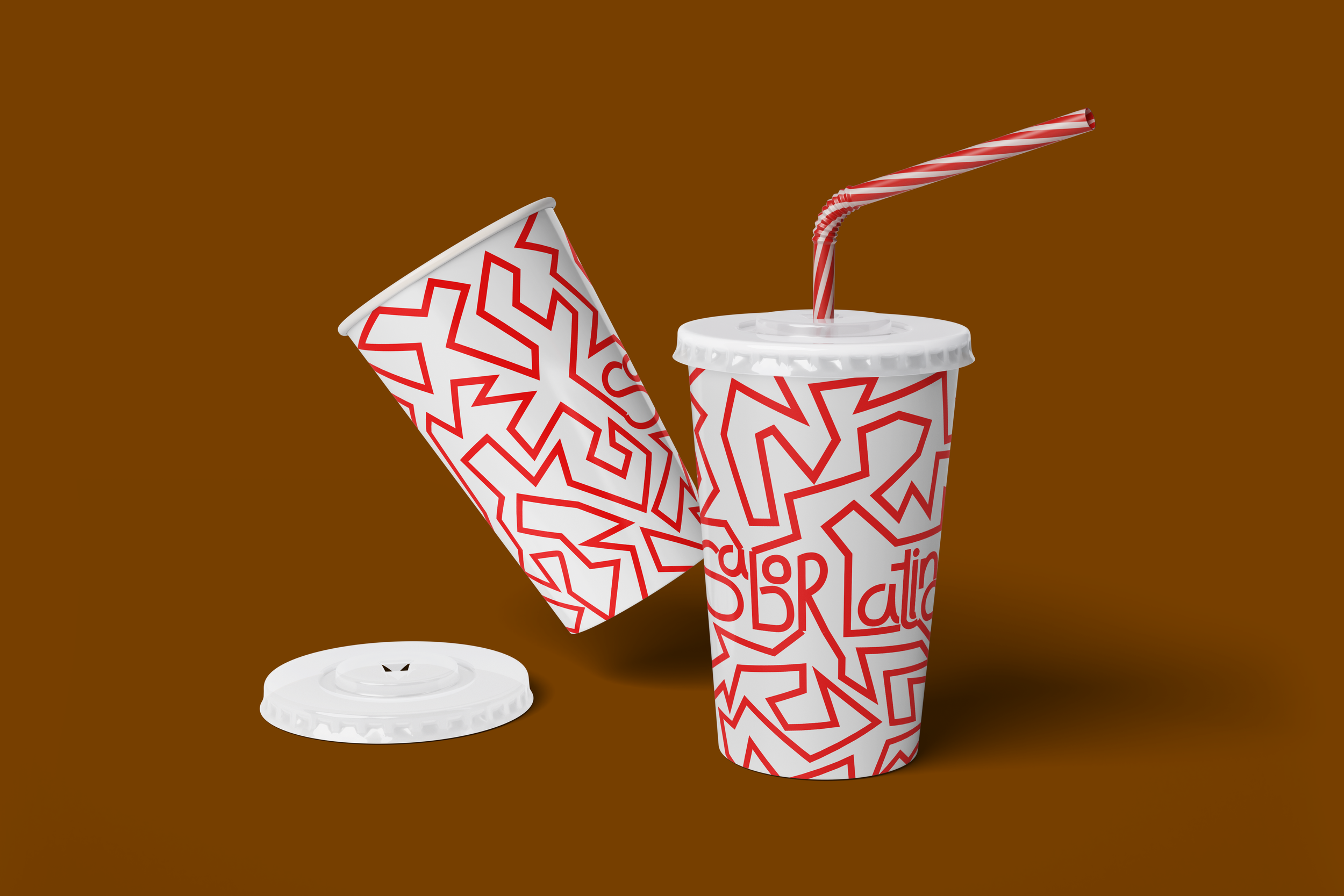
The visual system expanded into an app icon, a continuous zigzag pattern applied to takeout bags and cups, and a quick motion logo animation with upbeat timing and energetic movement. Each element was designed to feel cohesive while adapting naturally across both print and digital applications.